If you’ve ever stared at a blank custom sock design tool, hovering over color swatches until your cursor turns into a blur, you know the question that haunts every small business owner, event planner, or group leader: how do I pick colors that don’t look messy, don’t get lost, and actually feel like my brand, team, or event? As a custom sock supplier who’s walked this walk (more times than I can count, honestly—we’ve filled orders for soccer teams, coffee shops, and even a high school’s spirit week), I’ve seen people nail their color combos on the first try… and I’ve seen them end up with socks that look like a toddler spilled a crayon box onto a tube of spandex. Today, I’m breaking down how to choose color combinations that work—no design degree required, no guesswork, just real, testable rules that come from both color theory and years of listening to what our clients actually love (and what they wish they’d avoided). Custom Socks

First, let’s get one thing straight: color is emotional. It’s not just a set of numbers on a screen. When a client comes to us saying they want socks for a youth soccer team that “feel playful but not childish,” or a local bookstore’s swag that “feels like curling up with a good book,” I don’t just pull a color wheel and call it a day. I start with purpose, because every color combo serves a goal. A custom sock for a marathon runner needs to be visible, so it’s not getting lost under rain gear or crowd noise—bright, high-contrast colors are non-negotiable here. A sock for a luxury spa’s take-home gift needs to feel calm, soft, and relaxing, so muted, complementary tones are the way to go. A sock for a punk rock band’s merch needs to feel edgy, bold, and unapologetic, so maybe a high-contrast triad or a neon accent that pops against a dark base. If you skip this first step—defining what your socks are supposed to do—you’re picking colors in a vacuum, and that’s how you end up with a sock that looks great in your head but feels totally wrong when it’s printed.
Once you’ve nailed the purpose, it’s time to lean on color theory—but make it simple, not textbook-jargon-heavy. I don’t drag out my old art school color wheel for every client, because most people don’t remember what a “complementary triad” is. But there are two core theories that we see work 90% of the time when it comes to custom socks, and they’re easy to apply even if you’re not a designer.
The first is the complementary color system: colors that sit directly opposite each other on the color wheel. The rule here is pick one dominant color (60% of your sock, usually the main base or the largest panel) and a complementary accent (30%—think a stripe or a bold logo) that works with it, then a tiny neutral (10%—like white or black for text or small details). For example, blue and orange: if you’re making socks for a beach volunteer group, a deep navy base (60%), a tangerine stripe along the calf (30%), and white for the volunteer number or logo text (10%) works. It’s bright, easy to spot on sand, and feels playful without being overwhelming. Red and green? Wait, that’s why so many people mess this up—they use Christmas colors year-round, because they don’t understand that complementary pairs aren’t just for holidays. For a local garden center, a forest green base (60%), a cherry red leaf accent (30%), and beige for tiny potting tool details (10%) works perfectly. It’s seasonal, but it’s not gaudy, and it ties directly to the center’s brand. The key with complementary pairs is that one needs to be more muted if you don’t want them to clash. A bright lime green base and a neon orange accent? That’s going to make people’s eyes hurt. But a soft sage green and a terracotta orange? Warm, calm, and distinct.
The second system, and my personal favorite for custom socks, is the analogous color scheme: colors that sit next to each other on the color wheel. This is for when you want something cohesive, calm, and on-brand—no loud contrast, just a flow that feels intentional. A lot of our small business clients love this for their everyday merch, because it doesn’t shout “advertisement” but still feels tied to their brand. For example, a coffee roaster’s socks: soft brown, warm cream, and a tiny touch of burnt sienna. If you make the brown the base (60%), cream for the heel and toe (30%), and sienna for the logo (10%), that sock feels like a warm cup of coffee—no neon, no clashing, just a subtle nod to what the brand does. For a yoga studio’s socks? Pale lavender, soft gray, and a hint of sky blue. That’s calming, matches studio walls, and feels intentional without being boring. The mistake here is adding too many analogous colors. If you pick five colors that are all next to each other, it just becomes a muddy mess. Stick to three, max, for custom socks—especially when you’re working with limited print space (most custom socks have 3-4 print areas total, so extra colors don’t just look bad, they cost more).
Wait, but what if you’re using your brand’s existing colors? That’s the most common question we get. A coffee shop will say, “Our logo is this exact shade of green and this exact shade of brown—how do I translate that to socks?” The first rule here is test the colors on fabric. Let’s be real: every screen shows color differently. The bright green on your laptop might be a neon that washes out when printed on soft cotton, or the muted brown in your logo might turn muddy when paired with a dark gray. At our shop, we always advise clients to ask for a digital mockup first, but even better—we can send fabric swatches of our sock blanks, and you can bring your logo file to a local print shop to test how the colors look on knit fabric. Another tip: if your brand logo has a transparent background, make sure the colors on the sock don’t get lost in the knit texture. A thin white outline around your logo or text will make it pop, even if the sock is a busy color. I had a local brewery client last year who gave us a deep forest green and a golden yellow for their socks. Their original mockup had the yellow logo printed directly on the green base, but when we tested it, the fine lettering of their “Hoppy Hour” tagline got lost. We added a 1/16 inch white outline, and it fixed the whole thing—no extra cost, just a small detail that made the sock look intentional, not rushed.
What about avoiding common color mistakes? I’ve seen so many socks that look like they belong in a 90s mall commercial, and most of the time it’s these simple missteps. First, don’t use more than three main colors for custom socks. Any more than that, and it starts to look cluttered. I had a high school senior class order once where the student council wanted red, blue, yellow, green, purple, and orange on their spirit socks. We tried to explain that it would look like a Halloween costume, but they insisted. The final product had such busy knit lines that the graduation year on the heel was unreadable, and half the class ended up donating them because they wouldn’t wear them. Stick to three, with neutral accents if needed. Second, avoid color combinations that clash in print. The same rule applies here as with brands: test, don’t guess. Hot pink and lime green look great on a digital graphic, but when printed on a sock, they can make your eyes feel strained after a few minutes. Third, think about the context where the socks will be worn. Socks for a wedding groomsmen: soft blues, grays, and whites, because they’ll be worn with suits—bright neon orange would look totally out of place. Socks for a construction crew: high-contrast yellow and black, so they’re visible on job sites—pastel pink and purple would be impossible to spot in a busy worksite. Context is everything.
Another trick I learned early on: lean into your neutral friends. Neutrals (white, black, gray, beige) are the glue that holds any color combo together, and they’re underused in custom sock design. If you have a bold primary color you love—say, a bright royal blue for a kid’s soccer team—don’t pair it with a second bold color. Pair it with black for the heel and toe, and white for the stripes. That keeps the sock bold, readable, and not overwhelming. If your brand is minimalistic, a cream base, a light gray stripe, and a tiny black logo is all you need—no loud colors, just something that feels sleek and professional. Neutrals also help if you’re trying to make a design versatile: a customer can wear a sock with a navy base and a gray stripe with jeans, khakis, or shorts, so it gets more use than a sock with a neon base that only works for team spirit week.
Wait, what if someone wants something unique? A lot of our clients come to us and say, “I don’t want boring socks—can I do something that feels like me but not clashing?” My go-to for that is a pop accent color. Pick a neutral base (white, gray, black) that goes with everything, add one or two subtle analogous colors for cohesion, and then add one bright, unexpected accent for a pop that feels intentional, not messy. For example, a graphic design studio’s custom socks: a heather gray base, soft blue and beige stripes along the calf, and a tiny hot pink dot for the “i” in their logo. That’s unique, it ties to their brand, and it doesn’t look like a mess. We also work with a lot of indie musicians who want custom merch socks—they’ll pick a dark black base, deep purple stripes, and a bright magenta accent for their band name. It’s bold, it stands out on concert floors, and it doesn’t clash with their existing album art. The key here is that the pop accent is small—10% of the sock, max. If you make the accent too big, it becomes the main color, and you lose that cohesive flow.
I should also mention that different materials can change how colors look. At our shop, we use combed cotton for most custom socks, because it’s soft, durable, and the best at holding vibrant, long-lasting color. But if you’re ordering moisture-wicking socks for a sports team, the synthetic knit will make slightly muted colors look brighter, so you might need to adjust your combo accordingly. We always share color swatches with clients before finalizing an order, so you can see exactly how your chosen shades look on the exact sock material you’re getting—no surprises. Last year, a running club ordered socks for their marathon team, and they’d picked a neon green and neon pink combo from their laptop. When we sent them swatches, the neon pink was too bright for the synthetic fabric, and it would have blinded people on the course. We adjusted the pink to a softer coral, and the combo worked perfectly—still bright enough to be visible, but not overwhelming. That’s why we offer swatches, even for small orders; it’s a small step that saves everyone from regret.
Now, let’s talk about the actual design process, because color choice is only part of the battle. When you submit a custom sock design to us, you’ll get a digital mockup before we print, and that’s your chance to adjust colors if something looks off. Don’t be afraid to ask for tweaks—we do this every day, and we’re happy to adjust shade, size, or placement to make your combo work. A common mistake people make is centering their logo too much or making stripes too thin; adjusting the width of a stripe or shifting a logo by an inch can make a color combo feel balanced instead of lopsided. For example, a client once had a red and blue base with a logo centered on the ankle, but it looked like the logo was floating in the middle of a flag. We shifted the logo to the lower part of the sock, and made the blue stripe on the top calf slightly wider than the red on the foot, which made the whole thing feel more intentional.
At the end of the day, the best color combination for custom socks is one that works for your specific goal, not a rule from a textbook. If you’re making socks for a kids’ birthday party, go bright, go bold, make them fun—no one’s going to care if it’s a perfect complementary triad if the birthday kid loves them. If you’re making socks for a corporate event, go cohesive, go on-brand, make them feel professional. If you’re making socks for a small business’s swag, go versatile, go subtle enough that people will actually wear them, not just stuff them in a drawer. The worst color combo isn’t a “wrong” one—it’s a combo that doesn’t match what you’re trying to do.
If you’re ready to stop staring at color swatches and start turning your vision into custom socks, we’re here to help. We work with groups of all sizes, from small local teams to national brands, and we walk you through every step—from choosing colors to finalizing a mockup—so you don’t have to figure it out alone.
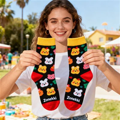
If you’re ready to turn your color ideas into custom socks, get in touch to start your design and procurement process today.
Custom Socks References
Birren, F. (1950). Color Psychology and Color Therapy: A Factual Study of the Influence of Color on Human Welfare. McGraw-Hill.
Eitzel, M. (2018). The Designer’s Color Manual: A Comprehensive Guide to Color Theory and Application. Rockport Publishers.
Kuehni, R. G. (2010). Color Space and Its Divisions: Color Order from Antiquity to the Present. John Wiley & Sons.
Zhuji Uron Apparel Co., Ltd.
As one of the most professional custom socks manufacturers and suppliers in China, we have world-leading production equipment and strong manufacturing capabilities. Please feel free to wholesale bulk custom socks from our factory. Contact us for more cheap products.
Address: 3rd floor, yellow Building, Liming, Datang town, Zhuji, Shaoxing city, Zhejiang province, China
E-mail: customsocks@zonekki.com
WebSite: https://www.zonekki-socks.com/
